One such book has been sitting on top of the bookcase in my bedroom for at least 2 years. I purchased "A Handbook for Classroom Instruction that Works" several years ago for $2.50 at a used book store in town, but other than casually flipping through it, I hadn't really opened it up and read it. Last week, on the way to my mom's house, I finally took the opportunity to start reading the book. I'm not very far into it because the first section caused me to pause and reflect! :)
Module 1 is on Comparing. Most of the module focused on how to teach students to compare, especially using everyday comparisons and the ever popular Venn Diagram. However, on the pages following the Venn, the author introduced the Comparison Matrix. This was the first time I had seen the Comparison Matrix and immediately I thought that it might be a useful organizational structure in my AP Statistics class to introduce comparing distributions.
In AP Stat, one of the topics that students are expected to be able to do is compare two or more distributions in terms of Shape, Odd Features, Center, and Spread. Having been an AP Teacher for 14 years and an experienced AP Reader, I know that this expectation is easier said than done. More often than not, students give a "laundry list" of attributes rather than a comparison. In order to compare two distributions, students need to use comparative language... higher, lower, wider, narrow, more spread out, etc.
For example:

The above graph is from a previous AP Statistics Free Response Question and part of the question asked students to compare the distances traveled by a Ping-Pong ball launched from the two catapult designs. It is all too common for students to literally list the shape, center, and spread for the distributions and totally ignore the fact that Catapult B seems to be more consistent as shown by the smaller range and on average, Catapult B seems to go slightly further than Catapult A. Ideally we would like for students to mention this comparative aspect of which dataset is more/less spread out and which dataset has the higher/lower center.
So, as I was reading the "Handbook" and ran across the Comparison Matrix, a problem like the Catapult problem immediately came to mind. I jotted myself a few notes and then when I got home that evening, created this:
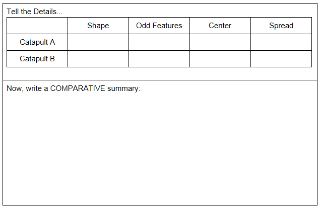
The idea is to use this to help guide my students thinking and hopefully they will realize that a "laundry list" isn't enough! The top boxes are for them to create the laundry list and make sure they remember all of the important attributes. Then, they have to communicate and compare the distributions using comparative language. Hopefully this organizational scheme will help some of them think through their descriptions of data... :)
No comments:
Post a Comment